af Anton Alexeyevich 8 år siden
1857
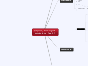
@angular/flex-layout

af Anton Alexeyevich 8 år siden
1857

Mere som dette
# Maximizes width and height of element in a layout container
@ Adds styles: margin: 0; width: 100%; height: 100%; min-width: 100%; min-height: 100%;
@ Adds styles: margin: 0; width: 100%; height: 100%; min-width: 100%; min-height: 100%;
@ Adds styles: margin: 0; width: 100%; height: 100%; min-width: 100%; min-height: 100%;
# Works like fxLayoutAlign, but applies only to a single flexbox item, instead of all of them. CSS Rule: align-self
# Offset a flexbox item in its parent container flow layout. @ adds margin-left to element. ! fxLayoutGap overlapping this option (in beta.8)
# Defines the order of a flexbox item. CSS Rule: order
# This markup specifies the resizing of its host element within a flexbox container flow. CSS rule: flex
# Defines how flexbox items are aligned according to both the main-axis and the cross-axis, within a flexbox container. @ the value has 2 parts 1. main-axis (justify-content) align. Values: none *start center end space-around space-between 2. cross-axis (align-items & align-content) align. Values: none start center end *stretch
# Defines if child items within a flexbox container should have a gap. @ adds margin-right to each child element expect the last Value units: % px vw vh
# Defines if child items appear on a single line or on multiple lines within a flexbox container. CSS Rule: flex-wrap Values: *"" nowrap wrap wrap-reverse Default: "" that means wrap
# Defines the flow order of child items within a flexbox container Values: *row column