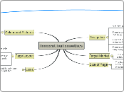
Innocent fruit smoothies
Navigation
At the top of the page are 8 main links to find items quicker
If you click on one of these links you will find lots of catagories inside with bright and colourful pictures to help find the right one
There are more links displayed on the side of the page linked to the page you are already on.
There is a site map at the bottom corner of the main page incase you get lost
This map lists the links inside the main links
One of the links will take you to the Innocent Smoothies for Kids website. Click on the link to find out more...
There is a list on the right hand side of the homepage listing the daily thoughts to keep people interested and not bored.
Target Market
This website is generally made for older teenagers and adults although there is links to innocent kids
Size of Page
The page size is generally great! No scrolling on the main page some on the others. Unfortunately on the blog page there is a lot of scrolling to be done (but then again it is a blog!)
Colour and Pictures
The background is white with lots of colourful pictures and writing.
Some of the pictures are animated slightly to help you understand them more.
There are 3 main pictures on the home page advertising different new competions, games and new themes
They even have a gallery of reguarlly updated pictures
Page Layout
Most of the pages have a main body of text with links at the side, above and below.
The main logo is always situated at the top left hand corner of the page. It contains a link to the main page. This is extremly handy if you know what it does but otherwise extremely annoying.
Links
The links are well placed are out of the way but still easily seen. They are also easily noticable as they are in a purple font.
