von josephat mokamba Vor 9 Jahren
344
SSP 740 - Navigation

von josephat mokamba Vor 9 Jahren
344

Mehr dazu
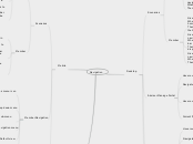
After logging in on mobile view, mobile menu should be minimised
Navigation menu collapses
Currently active link drops down displaying sub-menu links
'MENU' text
Clickable
Menu drop down displaying links
Given: An advisor is viewing sub-menu items in the navigation bar dropdown When: They tap outside the dropdown list Then: Dropdown list should collapse
Given: An advisor in their manage portal and wants to navigate to a page When: They tap the menu icon in the navigation bar Then: A drop down list of sub-menu links should be displayed
Given: A member logs in to their manage portal When: Successfully logged in and landed on homepage Then: Menu icon should be presented to the right in the header
Given: An advisor is viewing sub-menu items in the navigation bar dropdown When: They tap outside the dropdown list Then: Dropdown list should collapse
Shaded grey
Hovered link's text color does not change
Hovered link 's background highlighted to grey
Drop down list collapses
Drop down list of sub-menu items displayed
Given: An advisor is viewing sub-menu items in the navigation bar dropdown When: They navigate outside the hovered menu item Then: Dropdown list should collapse
Given: A member in their manage portal and wants to navigate to a page When: They hover over a menu item in the navigation bar Then: A drop down list of sub-menu links should be displayed
Given: A member logs in to their manage portal When: Successfully logged in and landed on homepage Then: Navigation menu bar should be presented under the header
Given: An advisor is viewing sub-menu items in the navigation bar dropdown When: They navigate outside the hovered menu item Then: Dropdown list should collapse
Given: An advisor in their manage portal and wants to navigate to a page When: They hover over a menu item in the navigation bar Then: A drop down list of sub-menu links should be displayed
Given: An adviser logs in to their manage portal When: Successfully logged in and enterred their portal Then: Navigation menu bar should be presented under the header