Organizing and Representing Data: Visual Representations
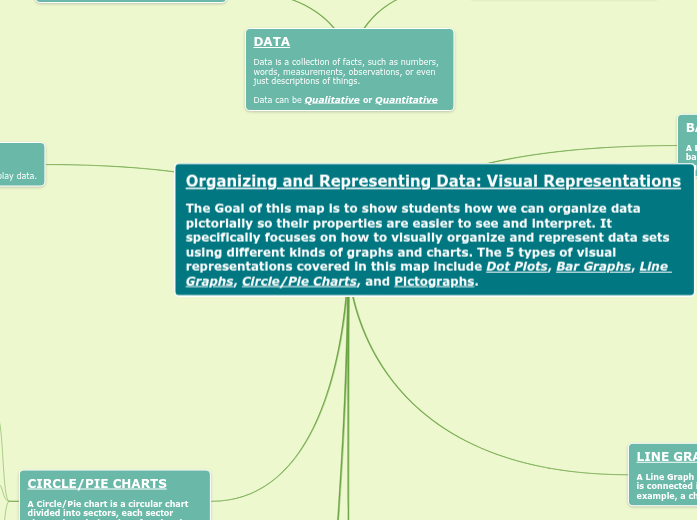
The Goal of this map is to show students how we can organize data pictorially so their properties are easier to see and interpret. It specifically focuses on how to visually organize and represent data sets using different kinds of graphs and charts. The 5 types of visual representations covered in this map include Dot Plots, Bar Graphs, Line Graphs, Circle/Pie Charts, and Pictographs.
BAR GRAPHS
A Bar Graph uses horizontal or vertical bars to display data in order to display quantities.

Data & Bar Graph Example
Students are introduced to the parts of a bar graph and the purpose of each. They are then shown how to read and interpret data from horizontal and vertical graphs.
Constructing Bar Graphs
Students are shown how to construct a bar graph from a set of data. Step-by-step procedures are listed along with large, detailed bar graphs.


Example of a Horizontal Bar Graph

Example of a Vertical Bar Graph
LINE GRAPHS
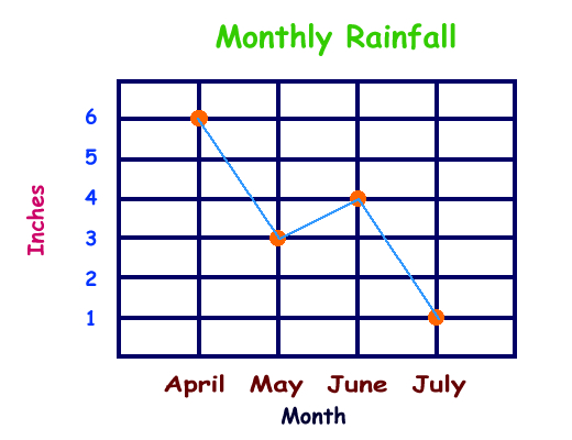
A Line Graph shows information that is connected in some way. For example, a change over time.
Constructing a Line Graph
Students are shown how to construct a line graph from a set of data. Step-by-step procedures are listed along with large, detailed graphs for visual reference.

Line Graph Example

More Data & Line Graph Examples
Students are introduced to the parts of a line graph and the purpose of each. They are shown how to read and interpret data from a line graph.

PICTOGRAPHS
A Pictograph is a visual presentation of data using icons, pictures, or symbols in place of common graph elements such as bars, lines, or points.
Additional Example of a Pictograph

Mystery Drink Pictograph Lesson Plan
In this lesson, student collect, organize, record, and display data in pictographs where each picture might represent more than one piece of data. They will then interpret the information from the pictographs they create.

Learn About Pictographs Video
DOT PLOTS
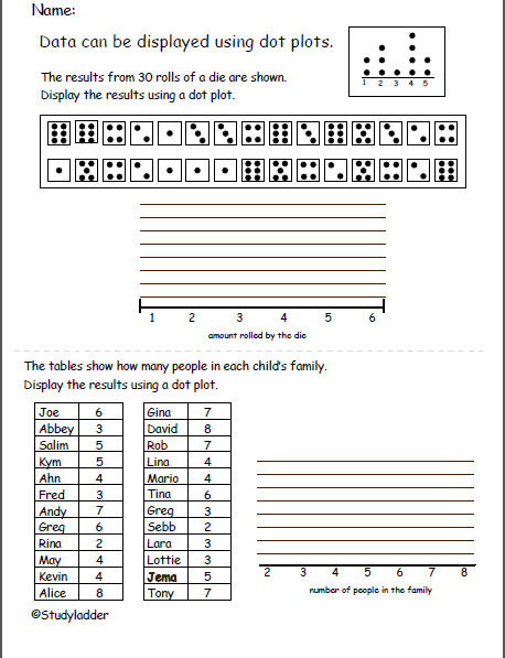
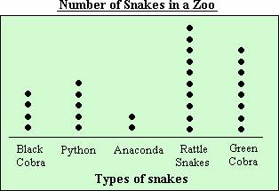
Dot Plots use dots to display data.
Dot Plot Activity

Dot Plot Video Example

Dot Plot Example

CIRCLE/PIE CHARTS
A Circle/Pie chart is a circular chart divided into sectors, each sector shows the relative size of each value.

Data & Circle/Pie Charts
Students are introduced to the parts of a circle chart and the purpose of each. They are shown how to read and interpret data from a circle graph.

Construction Circle/Pie Charts
Students are shown how to construct a circle graph from a set of data. They are also shown how to compute the angle measure for each item in the circle graph. Step-by-step procedures are listed along with large, detailed graphs.
Visual Example of a Circle/Pie Chart
Main topic
Examples of Data

DATA
Data is a collection of facts, such as numbers, words, measurements, observations, or even just descriptions of things.
Data can be Qualitative or Quantitative
QUALITATIVE DATA is descriptive information. This data describes something.
QUANTITATIVE DATA is numerical information. This data involves numbers.
Pictographs use relative sizes or repetitions of the same icon, picture, or symbol to show comparison.

