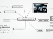
An advertisement created by BMW features a direct visual comparison between a BMW and a Jaguar, aiming to highlight the superiority of the BMW. The ad incorporates various elements such as color, logo, shape, short text, and a border to attract attention.
This ad an affect the jaguar car company in many ways, for example, how there are showing that the BMW is better, an make people choose a BMW over a Jaguar. Which will affect there business.
All though it affect the Jagular company it is actually a benfit for the BMW company because more people will buy BMW cars.
ELEMENTS
The elements of this BMW ad are... 1. colour 2. logo 3. shape 4. short text 5. border
EXPLICIT MESSAGE
The explicit message is telling people to buy a BMW because its better then a Jaguar.
PURPOSE
THIRUSHA MURUGADASS 7A
The purpose of this ad is to get the target audience to buy BMW'S new model car.
IMPLICIT MESSAGE
Another thing that i noticed was that, if you look at the other car the Jaguar is faced the wrong way which make it look as if the Jaguar was running away from the BMW.
This ad has no text,just two cars facing off,as in head to head. They are showing must of the BMW making its presence more promintent implying that its a more powerful car.
TARGET AUDIENCE
I think that for this ad,all adults are the target audience because they are the buyers of cars.