par Ana Ola Il y a 10 années
791
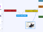
DATA ANALYSIS

par Ana Ola Il y a 10 années
791

Plus de détails
Time Plots are used for showing changes in data collected in regular intervals of time.
Scatterplots are used for bivariate data, to show the relationship between two numerical variables.
Trend line: overall pattern, slope. Calculated by substracting the G/L of y, and dividing it by G/L of x.
Histograms are graphs of frecuency distribution; the values are grouped into intervals, each one having
a relative frecuency.
Example
*Sample Standard Deviation: Mean of differences / n-1.
1) Calculate the mean 2) (Value of mean - each nº)2 3) Calculate the mean of differences 4) Possitive square root
Q3 - Q1
G-L
Number that occurs most frecuently in the list.
Middle value of an ordered list of numbers.
The mean is the sume of n numbers divided by n. The weight of the value is the nº of times a value appears on the list