App Startup (HEARME)
Homepage
Navigation Bar
Courses
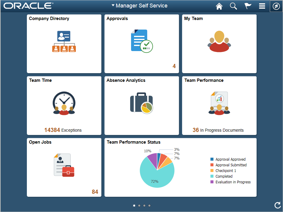
Multiple courses of different topics to learn about will appear in a new page using tiles as a format of organization, like in the picture.
Examples. Each category will contain its own preparation and quizzes for each of the topics that appear in courses along statistics for each individual course for each user.
Household Items
Course Statistics
Performance Rating
Percent Complete
Learning (Course using questions and images and text for learning.
Quiz (Questions using Y/N, complete answers, selection, matching, etc.)
Review
Technology
Course Statistics
Performance Rating
Percent Complete
Learning (Course using questions and images and text for learning.
Quiz (Questions using Y/N, complete answers, selection, matching, etc.)
Review
Slang Terms
Course Statistics
Performance Rating
Percent Complete
Learning (Course using questions and images and text for learning.
Quiz (Questions using Y/N, complete answers, selection, matching, etc.)
Review
Flashcards

You will be taken to a homepage containing different flashcard practices with different topics, again categorized using tiles.
Examples. Each category will contain a quiz that uses flashcard answers. The person will be shown flashcards of words and translations, and there will always be yes or no answers. These quizzes are meant to be extra practice.
Quiz: Household Items
Quiz (Yes or no answers)
Results
Percent correct
Reccomended courses for improvement
Option to try again (new questions)
Quiz: Technology
Quiz (Yes or no answers)
Results
Percent correct
Reccomended courses for improvement
Option to try again (new questions)
Quiz: Slang Terms
Quiz (Yes or no answers)
Results
Percent correct
Reccomended courses for improvement
Option to try again (new questions)
Quiz (Yes or no answers)
Results
Percent correct
Reccomended courses for improvement
Option to try again (new questions)
Mr. Handy
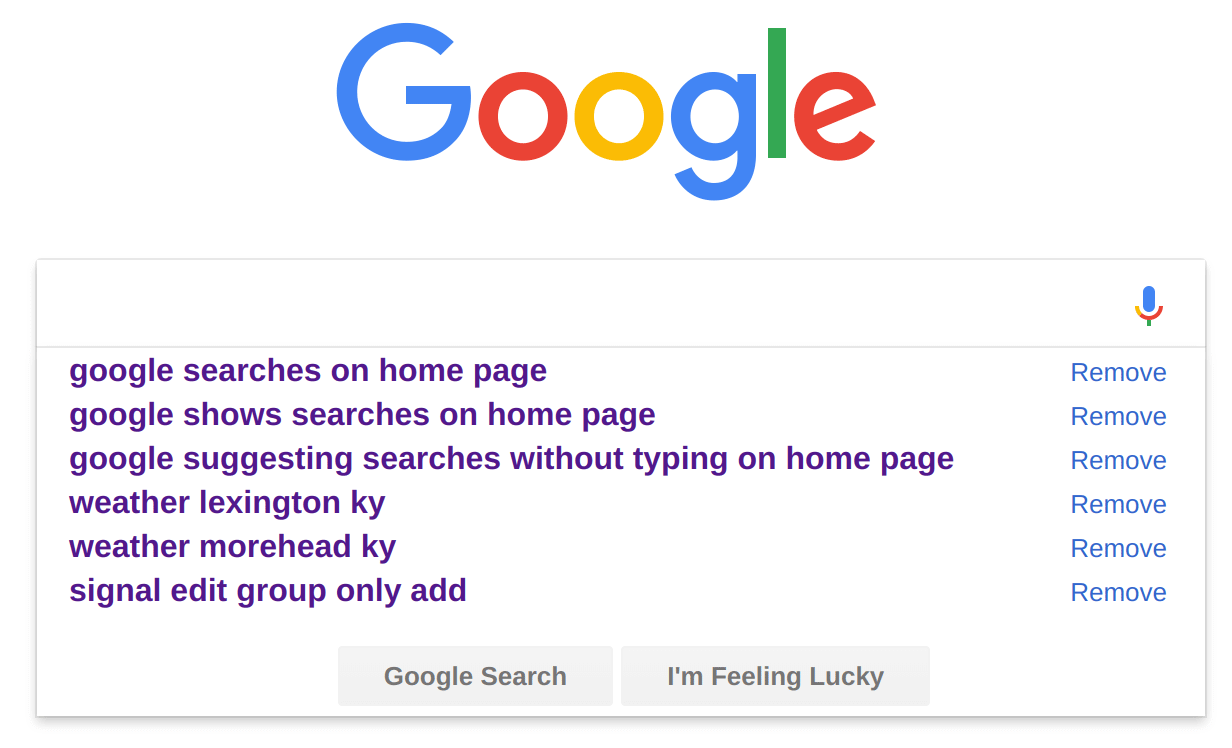
Mr. Handy is a search bar that you can enter any words in and will automatically search a database to answer what you've asked. It is like google: You enter anything and it shows results, and you can click those results to get your answer.
Search (input on bar)
Suggestions
Click suggestion link to go to suggestion site
Suggestion site
Full article (on site)
Results
Click on result displayed to go to this result's site
Result site
Full article (on site)
Forum
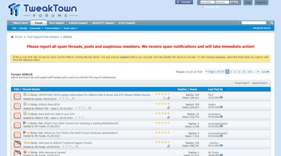
Forum articles (homepage containing most up voted articles)

Forum search bar
Suggestions (suggests existing articles organized by popularity)
Forum article
Forum title
Forum article (written by user)
Response section (any user can comment
Upvote (positively rate comment
Downvote (negatively rate comment)
Response button (to respond to article)
Direct forum links (can click from the homepage)
Forum article
Forum title
Forum article (written by user)
Response section (any user can comment
Information

News and starter (on homepage content)
Community recogntions

Article link (You can click on the article link to read more. You can see a tile containing a summary in the homepage.
Article site (place where the article was written, this will be a hyperlink)
Learner leaderboard
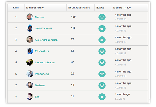
Link to full leader board containing statistics for all the learners showcased. It will consist in the top 10 best learners based on correct answers and score.
News (organized in tiles containing a picture and a summary)
Link to news site
News site (the site where the news comes from. Could be local or external.
General news involving the app around the web
Feature specifications

Font
The font will be Bahnschrift. It is a modern font that does not interfere with the aesthetic purposes of the other visual elements.

Animation style
Animations will be bouncy, cartoon animations. This makes the interface look friendlier, and gives it a playful accent, fulfilling this design specification.

Color gamut
The color gamut will use a variety of colors, but the prevailing ones will be green, red, yellow and orange and blue. It is a varied gamut so that the user can see more color, giving the app a more playful air.

Color usage
The colors will be used in a hierarchic way. The more intense colors will be used in more important segments, whereas the colder colors will be used for less important segments. This provides intuitivity to the design.

Sound usage
The interface will feature sounds such as bubble popping for pressing certain buttons, and other digitally sunthetized sounds that sound pleasant. They must be satisfying and sound playful.
