Digital content navigation
Evaluation
Proof-of-concept
Cards
Mockup
Case study
Publish recordings - folder of raw files
Write post
Upload
Master
Booking management - mail that requests it
Attachment with table
Booking site
Response
Research
Computing system
Content navigation system
Prototype
Work
Project 1
Issue 2
Reviewed code
Issue 1
StackOverflow
Eclipse
Running app
Time tracking
System description
Physical metaphor (affordance)
Works well when there are few direct children of any node
Use cases
Goal-oriented user interface
workspace is itself data
hierarchy can be built by opening related contents
Hierarchical content platform
Structural analysis of musical composition
Book
Website
Presentation
Old specification
commands
share subtree
edit
move
new / open
open after
parent is created if target is root
show below
keep focus
open below
close
navigate
keyboard
expand/collapse
entire subtree
n levels
first child
parent
previous
next
direct
change width weight
change height ratio
enter/exit full screen
focus
view
highlight recently visited nodes
history
animation
continuity
Animated transitions
What makes a good transitional interface?
fullscreen?
False
connect link with child
highlight border
siblings of focused
deck
only titles
shelf
only titles on sides
on border
neighbours
subtree
smaller with distance
path to focused
horizontal (~breadcrumb)
variable number
only titles (smaller with distance)
True
content of focused
model
aspect ratio range
maximum: Number
minimum: Number
layout of children
Horizontal/Vertical/Packed
ratio of subtree / content
0 = hide children
weight among siblings
Number
children
list of View
reference to Content
title
String
Environment
full screen
Truth
focused
reference to View
root
View
Alternatives
Box
focus =
pick from deck
open in shelf
all siblings can be visible
bring to top
siblings on border can be visible
zoom
only neighbors can be visible
nesting = hierarchy
open sliding lid = reveal children
Tree
flexible layout
High-level description
Node types
content
content group
displays children embedded, arranged automatically
user-specified title
Screen areas
Main
semantic ZUI
Left side
collapsible
hidable (hidden by default on mobile devices in portrait mode)
tree
Primary inspiration: Notion
Related work
Hierarchical spreadsheet
Optimized for large-scale models
Suitable only for small nodes
SIEUFERD - Direct Manipulation of Queries
Activity-Based Computing
Only one level of hierarchy
Windows 10 Sets
KDE Activities
Giornata
Laevo
Parallel connected pages
Manual rearrangement
Xanadu
Tab tree
Compared content hierarchy is not reflected in layout
No focus
Other forms
Tree with details
Table of contents
Tabs Outliner
Tab Groups
Tree Style Tab
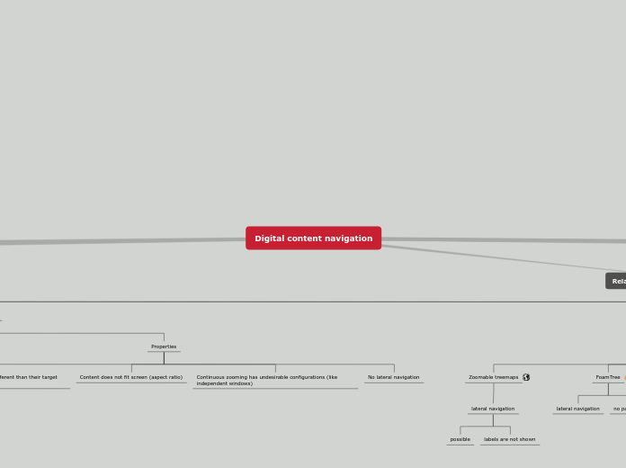
Zoomable treemap
Path to focused is indirect (breadcrumb)
Siblings of focused are often not visible
Tiling window managers
hierarchy is not always clear
Elastic Windows
no focus
Tinderbox
TreeSheets
no lateral navigation
FoamTree
no path to focused
Zoomable treemaps
lateral navigation
labels are not shown
possible
Zoomable user interface
No lateral navigation
Continuous zooming has undesirable configurations (like independent windows)
Content does not fit screen (aspect ratio)
Only for static content (links look different than their target content)
Prezi
Zoomable User Interfaces for the Authoring and Delivery of Slide Presentations
Zoomable User Interfaces: Communicating on a Canvas
Mind map
Properties
Needs navigation-based layout
Examples
Trails
History Tree
Visual History
Debugger Canvas
Code Bubbles
TheBrain
ZoomTree
Hoptrees
ControlTree
SpaceTree
Drawing Trees
SpaceTree.js
Requirements
Lateral navigation
navigation to siblings should be easy
Screen usage efficiency
maximize data-ink ratio
Comparison
showing multiple contents simultaneously should be easy
Focus
avoid distraction
Direct manipulation navigation
continuous feedback
Large nodes
enable any kind of content
Sense of location
always show current location
Clear structure
structure should be clear
Principles
Persistence
always preserve the user’s actions (including navigation)
operation history
previous versions are lost when exiting application or modifying after undo
need to save
modifications after saving are lost when application crashes
session handling
user's workspace is lost when operating system restarts
independent overlapping windows & applications
macOS virtual desktops: current desktop is lost when application is already open in another desktop
user's intent is lost when opening new window
version control systems
Visualization
show related information close to each other (relational-spatial interface)
violations
file-based editing (Eclipse)
can't show two methods simultaneously
selection-based views (Eclipse)
can't show same property of multiple elements
independent overlapping windows (stacking window managers)
overlapping is undesirable, manual positioning is needed
applications
opening a related piece of information in a different application is a huge context switch
slideshow (PowerPoint)
content's structure is invisible
workarounds
two-panel file manager
dockable windows
ad hoc grouping
macOS Split View
transient
only two windows
manual
multiple displays
examples
mind maps
IDEs with inline visualization
Light Table
callouts
guidelines
Spatial Interfaces
