Wallpaper Ruler 2.0

App Icon

Must show app initials: WR

Home Screen

A 3D scene representing an environment

a

Camera paning and zooming between areas

Access to main features

Each main feature has it's own focused area on the scene

Each feature area has a back button

Edit Mode

Android Crop/Scale

Android Crop/Scale
r

Watch the video. Notice how natural and easy it is to crop, scale and focus. The shape of the tool is also very important because it indicates how the wallpaper will actually behave. The shape is the guideline. This will replace the old Dead Corners, Only in Portrait/Landscape, Sweet Area.

Aviary Effects / Instagram like

Aviary Effects / Instagram like
r

View the demo. It has too many features and tools. We just want a small sub-set. Not sure exactly if this one will work.

a
BlackBerry Playbook

BlackBerry Playbook

Initial main platform

7 inches - 1024x600 - 17:10 - 170dpi

a

Landscape/horizontal main orientation

We break the guidelines - but not too much.

BlackBerry BB10

BlackBerry BB10

Built for BB

10k US$ commitment

a

App miight go native!!!

App can't be free

TOSC: Available in the Fall of 2012.

Probably will need to use Invoke Framework

a

International

r

All the listed languages will be supported on the app, website and Appworld.

English

Portugese

Italian

Spanish

French

My Gallery

My Gallery

a

Grid view

Sharing Pin

Sharing Pin

r

Sharing is vital for any app nowadays thus it's a must feature.The sharing on our app is called Sharing Pin. A social network, like Facebook or Twiter, is represented by a Push Pin.To share an item to a social network, the user drags the pin, that represents the social network of choice, placing it into a gallery's item. The first time the user does this action, it starts the Connect process which is usually a 2 steps:1- login screen2- permission promptThe Sharing Pin has 2 states: connected and disconnected. After the app is connected, the associated Pin changes to a stronger color. Before it's connected, the Pin has a pale/weaker color.

Local itens only

UX

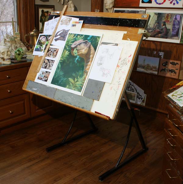
User's feels like an Artist or Architect

User's feels like an Artist or Architect

r

This is super important. I want the user to experience beeing like a creative person, like an architect that precisely creates and draws, or like a painter that express its feelings using colors and paints.I think the architect's drawing board fits more to our purpose because of the precision tools (rulers, set squares, drawing compasses). Our app helps the user precisely and efortlessly modify, adjust, fine tune an already created image to it's needs. See the link.The painter's canvas is not perfect because it implies a total freedom of creation, associated drawing tools like brushes, pencils, buckets, colors and etc. This is too much for the Edit Mode of the app.

Get the user into a creative mood

Beautiful inspiring surrounding

r

Beauty inspire people. We need a very good taste of colors, texture and lighting.

Unique remarkable experience

Gallery Item

Gallery Item

Frame hanging on the wall

Square, Landscape or Portrait

Has none or many Sharing Pins

Subtopic
a