Not enough data
used when we have distinct groups
Random number generator
Sampling sampled data
Correlation does not imply causation
Correlation = -1
Correlation = 1
We calculate correlation with the:
How strong the relationship is between the variables.
How one variable changes with respect to another.
No Skew: (Mean and median are EQUAL)
Long tail on right side: (Mean will be more than the median)
Long tail on left side: (Mean will be less than the median)
Represents the amount and direction of the skew.
Represents how tall and sharp the central peak is.
This can be seen on the graph as the intersection between the x and y axis for the given x value
F(x)
x
Each column in our data is a
An estimate of the CDF from the sample is called the:
This is an estimate of the distribution's (PDF)
Best with:
Best with:
Similar to histograms (KDEs) create bins for the data
In order to see how data is distributed inside each quartile we use
Version of box plot for visualizing dispersion
Visually represented by the:
Finding the probability of getting a value of x or less
Divide data into equal groups containing equal percentage of total.
Max-Min =
The distance between the 3rd and 1st quartiles:
Examples of misuse
Applications
Also known as the Relative Standard Deviation (RSD)
compare dispersion of two different datasets
The square root of the variance =
X-bar
Most common value
Middle value
μ=average
spread/dispersion of data
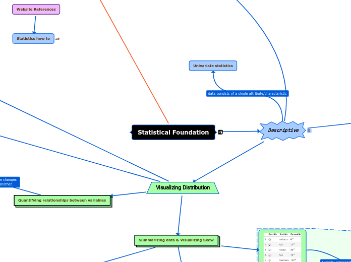
data consists of a single attribute/characteristic
If
Less sensitive to outliers than the Coefficent of variation
Integral (area under the curve) of the PDF:
use
Categorical data
standardized form of a Gaussian distribution in which μ = 0 and σ = 1.
Both can be used with either type of variable.
Both used to represent the distribution of data.
The PDF is for:

Statistical Foundation

m

Descriptive

r

describe the sample

Univariate statistics

Central Tendency

Mean

sample mean

sample mean

Median

Median

c1
If n is even

If n is even

Mode

Unimodal = 1 mode

bimodal = 2 modes

multimodal = many modes

Outliers

Tip

r

Tip The i th percentile is the value at which i% of the observations are less than that value, so the 99th percentile is the value in X where 99% of the x's are less than it.

Measure of spread from the (MEAN)

e1May22

Mean-based measures of dispersion

Variance

Variance

c1r

The variance describes how far apart observations are spread out from the average value (the mean). The population variance is denoted as σ2 (pronounced sigma-squared), and the sample variance is written as s2. It is calculated as the average squared distance from the mean. Note that the distances must be squared so that distances below the mean don't cancel out those above the mean.

d
Standard Deviation

Standard Deviation

c1r

Standard deviation We can use the standard deviation to see how far from the mean data points are on average. A small standard deviation means that values are close to the mean, while a large standard deviation means that values are dispersed more widely. This is tied to how we would imagine the distribution curve: the smaller the standard deviation, the thinner the peak of the curve (0.5); the larger the standard deviation, the wider the peak of the curve (2):The standard deviation is simply the square root of the variance. By performing this operation, we get a statistic in units that we can make sense of again ($ for our income example): Note that the population standard deviation is represented as σ, and the sample standard deviation is denoted as s.

d
Coefficient of Variation (CV)

Coefficient of Variation (CV)

c1

CV is the Ratio of the
standard deviation to the mean

Comparing Two Datasets
with different units problem

Compare volatility
or risk with the amount of
return expected from investments.

Comparing between parameters using relative units such as Celsius and Fahrenheit.

c1

Median-based measures of dispersion

Interquartile range (IQR)

Interquartile range (IQR)

Quantiles
(25%, 50%, 75%, and 100%)

Quartile coefficient of dispersion

Quartile coefficient of dispersion

r

 It is calculated by dividing the semi-quartile range (half the IQR) by the midhinge (midpoint between the first and third quartiles):

d

Range

c1r

Gives us the dispersion of the entire dataset. Downfall: it doesn't tell us about the dispersion at the center. it is useless if the data contains outliers.

Visualizing Distribution

Summarizing data & Visualizing Skew

5-number summary

5-number summary

Box plot (or box and whisker plot)

Box plot (or box and whisker plot)

r

Top line = Max or 75 quartile

Tukey box plot

r

The lower bound of the whiskers will be Q1 – 1.5 * IQR and the upper bound will be Q3 + 1.5 * IQR, which is called the Tukey box plot:

d
Histograms

Histograms

r

Important note:In practice, we need to play around with the number of bins to find the best value. However, we have to be careful as this can misrepresent the shape of the distribution.

Kernel density estimates (KDEs)

Kernel density estimates (KDEs)

r

KDEs can be used for discrete variables, but it is easy to confuse people that way.

Continuous variables 
(Heights or time)

Continuous variables
(Heights or time)

Probability density function (PDF)

r

The PDF tells us how probabilityis distributed over the values. (Higher values = Likelihoods)

Discrete variables 
(people & time)

Discrete variables
(people & time)

Rolling a 6-sided die can only result in 6 possible outcomes. (1,2,3,4,5, or 6) this is an example of a discrete variable because it isn't possible to role a 2.2 or 3.4 etc. On the other hand, a continuous variable such as height can end up being any number or fraction of a number between two discrete numbers. A persons hight can be 5"6" or 5"6.3" etc.

Both the KDE and Histogram
estimate the distribution.

Both the KDE and Histogram
estimate the distribution.

Cumulative distribution function (CDF)

Cumulative distribution function (CDF)

Empirical cumulative 
distribution function (ECDF)

Empirical cumulative
distribution function (ECDF)

r

import numpy as np x = np.sort(df['column_name']) y = np.arange(1,len(x)+1) / len(x) # by default plt.plot generates lines. To connect our data points we pass '.' to the marker and 'none' to the linestyle. _ = plt.plot(x,y, marker='.', linestyle = 'none') _ = plt.xlabel('percent of vote for Obama') _ = plt.ylabel('ECDF') To keep data off plot edges we set plot margins to (0.02)plt.margins(0.02)

d

x-axis = the sorted data being measured

r

import numpy as np x = np.sort(df['column_name'])

y-axis = evenly spaced data points with a maximum of 1

r

y = np.arange(1,len(x)+1) / len(x)

Cumulative Probability

Random Variable

r

Each column in our data is a random variable, because every time we observe it, we get a value according to the underlying distribution—it's not static.

Visualize Skew & Kurtosis

Kurtosis

r

Important note:There is also another statistic called kurtosis, which compares the density of the center of the distribution with the density at the tails. Both skewness and kurtosis can be calculated with the SciPy package.

Skew

Left (negative) skewed distribution

Left (negative) skewed distribution

Right (positive) skewed distribution

Right (positive) skewed distribution

No Skew

No Skew

Common distributions

r

While there are many probability distributions, each with specific use cases, there are some that we will come across often. The Gaussian, or normal, looks like a bell curve and is parameterized by its mean (μ) and standard deviation (σ). The standard normal (Z) has a mean of 0 and a standard deviation of 1. Many things in nature happen to follow the normal distribution, such as heights. Note that testing whether a distribution is normal is not trivial—check the Further reading section for more information. The Poisson distribution is a discrete distribution that is often used to model arrivals. The time between arrivals can be modeled with the exponential distribution. Both are defined by their mean, lambda (λ). The uniform distribution places equal likelihood on each value within its bounds. We often use this for random number generation. When we generate a random number to simulate a single success/failure outcome, it is called a Bernoulli trial. This is parameterized by the probability of success (p). When we run the same experiment multiple times (n), the total number of successes is then a binomial random variable. Both the Bernoulli and binomial distributions are discrete. We can visualize both discrete and continuous distributions; however, discrete distributions give us a probability mass function (PMF) instead of a PDF: 

d
Gaussian/normal

Gaussian/normal

Poisson distribution

Poisson distribution

Exponential distribution

Exponential distribution

Uniform distribution

Uniform distribution

Bernoulli trial

Bernoulli trial

Standard Normal (Z)

Binomial PMF - many Bernoulli trials

Binomial PMF - many Bernoulli trials

Quantifying relationships between variables

Covariance

Covariance

r

E[X] = the expected value of X or the expectation of X. It is calculated by summing all the possible values of X multiplied by their probability - it is the long-run average of X.This will tell us whether the variables are positively or negatively correlated.

d

Correlation

Pearson correlation coefficent

Pearson correlation coefficent

r

To find the correlation, we calculate the Pearson correlation coefficient, symbolized by ρ (the Greek letter rho), by dividing the covariance by the product of the standard deviations of the variables:This normalizes the covariance and results in a statistic bounded between -1 and 1, making it easy to describe both the direction of the correlating (sign) and the strength of it (magnitude).

d

Perfect positive (linear) correlation
[as x increases y increases]

Scatter plot example of correlation
between x and y variables.

Scatter plot example of correlation
between x and y variables.

It is possible that there is another variable Z that causes both X and Y.

Perfect negative correlation
[as x increases y decreases]

Standardize data between two distributions

Scaling data

r

In order to compare variables from different distributions we have to scale the data. There are, of course, additional ways to scale our data, and the one we end up choosing will be dependent on our data and what we are trying to do with it. By keeping the measures of central tendency and measures of dispersion in mind, you will be able to identify how the scaling of data is being done in any other methods you come across.

min-max scaling

min-max scaling

r

Take each data point and subtract it by the minimum of the dataset, then divide by the range. This normalizes the data (scales it to the range [0,1]).

d
Z-score

Z-score

r

To standardize using the Z-score we would subtract the mean from each observation and then divide by the standard deviation to standardize the data. The resulting distribution is normalized with a mean of 0 and a standard deviation (and variance) of 1.

d

Sampling

r

Should always be randomly sampled.

Resampling

simple random sample

stratified random sample

randomly pick preserving the
population of groups in the data

bootstrap sample

Resources For Bootstrap Information
Unitless measure of Dispersion

Floating topic

Website References

Statistics how to