Used to report on a wide variety of variables including prices and wages, ultraviolet levels in sunlight and even the readability of textbook
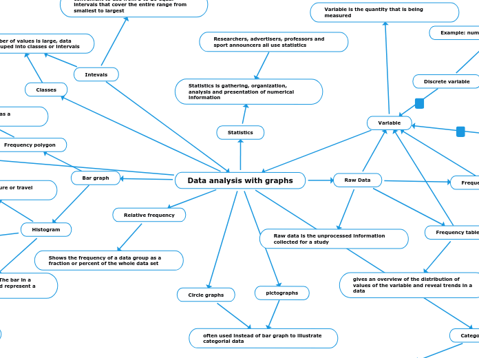
Researchers, advertisers, professors and sport announcers all use statistics
Frequency polygon
illustrate the same information as a histogram or bar graph
Histogram
Example: weights, temperature or travel time
They are used for variables whose values can be arranged in numerical order
Specials form of bar graph. The bar in a histogram are connected and represent a continuous range of values
Intevals
convenient to use from 5 to 20 equal intervals that cover the entire range from smallest to largest
When the number of values is large, data are usually grouped into classes or intervals
Continuous variable
Example: Hight of a student in your school
Value within given range
Discrete variable
Example: number of students in each class
certain separate values
Data analysis with graphs
Statistics Concept Map
Measures of Central Tendency
Outliers
values distant from majority of the data
Mode
Some distributions do not have mode while others have several
the value that occurs most frequently in a distribution
Median
Middle value of the data when they are ranked highest to lowest
Mean
Mean is also known as average
defined as the sum of the value of a variable divided by the number of values
Used to summarize a set of data
Bias in Surveys
Response Bias
This occurs when participants in a survey deliberately give false answers
Measurement Bias
This occurs when the data collected method consistently either under or overestimates a characteristics of the population
Non Response Bias
This occurs when particular group are under represented in a survey because they choose not to participate
Sample Bias
This occurs when the sampling frame does not reflect the characteristics of the population
Sampling Techniques
Convenience Sample
Sample is selected because it is easily accessible
Voluntary Response Sample
The researchers simply invites any member of the population to participate in the survey
Multi Stage Sample
Example: population consisted of all Ontario households, you could first randomly sample all cities and townships then sample all subdivisions or blocks then finally sample from all the houses
Uses several levels of random sampling
Cluster Sample
Examples: Fast food chain could save time and money by severing all its employees at random selected locations instead of surveying randomly selected employees throughout the chain
If certain groups are likely to be represent of the entire population, you can use a random selection of such groups as a cluster sample
Stratified Sample
Has the same proportion of members from each stratum as the population
group of members who share common characteristics
Example: Gender, age, education level, etc
Systematic Sample
You go through the population sequentially and select members at regular intervals
Simple Random Sample
Select names by drawing names randomly or by assigning each member with a number then using a random number generator to pick
Every member has an equal chance of being selected and the selection of any particular individual does not affect the chance of others
Sampling frame
The group of individuals who actually have a chance of being selected
Population
Example students in your school
Refers to all individuals who belong to a group being studied
Indices
Readability index
used to estimate the years of schooling required to read the material easily
Gunning fog is a measure of readability index
Consumer price index
consumer price index and cost of living index are not the same
Inflation
Increases in price which corresponds to a decrease in the value of money
Most widely reported of these economic indices
Time series graph
Used to show how indices change overtime
Index
The base level is set so that the index produces number that are easy to understand and compare
relates the value of a variable to base level which is often the value on a particular data
Another way to summarize data and recognize trends
pictographs
Circle graphs
often used instead of bar graph to illustrate categorial data
Categorical data
Example: surveys of blood types, citizenship, favorite foods
Given Labels rather than being measured numerically
Relative frequency
Shows the frequency of a data group as a fraction or percent of the whole data set
Bar graph
Classes
Raw Data
Frequency diagram
Frequency table
gives an overview of the distribution of values of the variable and reveal trends in a data
Variable
Variable is the quantity that is being measured
Raw data is the unprocessed information collected for a study
Statistics
Statistics is gathering, organization, analysis and presentation of numerical information


