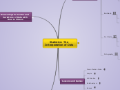
Statistics: The
Interpertation of Data
The goal of this map is to outline information, ideas, and online games for learning Statistics and Data. The audience for this map is elementary teachers and students.
Statistical Inference
with Definitions
the theory, methods, and practice of forming judgments about the parameters of a population and the reliability of statistical relationships, typically on the basis of random sampling.
Z Score
A Z-score is a statistical measurement of a
score's relationship to the mean in a group of
scores.
Percentile
Percentile: each of the 100 equal groups into which a population can be divided according to the distribution of values of a particular variable.
Normal Distribution
For a population that has a normal distribution, about 68% falls within 1 standard deviation of the mean, about 95% falls within 2 standard deviations of the mean, and about 99.7% falls within 3 standard deviations.
Random Sample
A Random Sample of size is a subset of individuals from the population chosen in such a way that every such subset has an equal chance of being chosen.
Sample
Sample is a subset of the population.
Population
Population is a particular set of objects about which one desires information.
Measuring the Center and
Variations of Data with
How to Videos
Box Plot
A box plot, or Box and Whisker Plot, consist of a central bow extending from the lower to the upper quartile, with a line marking the median and line segments, or whiskers, extending outward from the box to the extremes.
Video on creating Box Plot
Outlier
Outlier: in a set of data is a data value that does not seem to makes sense with the rest of the data. A number being very small or very large.
How to find the outliers.
Standard Deviation
Standard Deviation: A measure of the typical deviation from the mean.
Quartiles
Quartiles: casually speaking, these values divide the data set into four sections, each of which contains, in increasing order, about 1/4 of the data.
Lower Quartile: is the median of the first half of the data values.
Upper Quartile: is the median of the last half of the data values.
Video Teaches on the different
quartiles of a set of data
Range
Range: the difference between the smallest and largest data values.
Interquartile Range (IQR): is the difference between the upper and the lower quartile.
A teaching video on how to find the range
Mode
Mode: the value that occurs most frequently in a collection of values.
If two or more values occur equally often and more frequently than all other values, there are two or more modes.
Video showing how to find
the mode of a data set
Median
Median: the middle value in a collection when the values are arranged in order of increasing size.
Data values are written in order of increasing size,
If the amount of numbers are odd, the median is the middle value in the list.
If the amount of numbers are even, the median is the average of the two middle values.
Video on how to find the median
Mean
Mean: The arithmetic mean, or average.
The formula for mean:
S divided by N
S= the sum of the values
N= the number of values
Video teaching on, how to find the mean
Lessons and Games
Lesson Ideas
Games
Data Analysis
K-2 Practice
Graphs
Mean Median Mode
Organizing and
Representing Data
There are a variety of ways to represent data depending on what type of data you have, you will then choose what type of graph to use.
Pictographs
Pictographs are useful in comparing quantities.
Example of
books sold
Pie Charts
Pie Charts represents relative amounts to a whole.
Pie Chart Practice
Example using
imported fruits
Bar Graph
Bar Graphs use categorical data, where the horizontal scale may be some nonnumerical attribute.
Bar Graph Review
Example of a
polled survey.
Line Graphs
Line Graphs can use a variety of data.
Example using average temperatures.
Histograms
Histograms use data that is grouped into intervals.
Example using birth
weight of lambs.
Stem and Leaf
Stem and Leaf Plots are also used to summarize relatively small sets of data.
Example using a set of numbers.
Dot Plot
Dot Plots are used to summarize relatively small sets of data.
Dot Plot Creating
Example
