Evidence 2
Ilse Patricia Gomez Benitez 1937714 Gerardo Lopez Flores 1828938
References
McComb, M. A. (2008). The quality toolbox. Technometrics, 50(3), 408.
Straker, D. (1995). A toolbook for quality improvement and problem solving. Macmillan College.
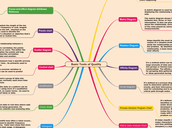
Basic Tools of Quality
Type in the name of the book you have read.
Histogram
Used to identify how often a value occurs , normally used to identify frequency distributions, Taller bars show that more data falls in that range. A histogram displays the shape and spread of continuous sample data.
Examples: The primary use of a Histogram Chart is to display the distribution (or “shape”) of the values in a data series.
They can be used to display data over time , time represented along a horizontal axis
Check sheet
Used to collect data in real time where said information is being generated. Its prepared from collectin and analyzing data.
Examples : when collecting data based on frequency on posters of events .
To provide a structured way to collect quality-related data as a rough means for assessing a process or as an input to other analyses.
Also used to record the occurrences of activities. In a table or diagram form they are extremely useful as a data collection device and record to supplement attribute quality control charts.
Stratification
Used to segment a group of data into layers/ groups, normally used more than one analysis tool.
It separates the data so a pattern can be see, normally using more of a qualitative approach to it. In easier terms , its used to sort a group of ideas or data.
Example: normally used to identify an idea coming from various sources,
Such action is used by politicians in various aspects , by stratifying a group of people by income, language, jobs etc, all with the purpose in obtaining a single answer or to find a common ground.
Control chart
Type the main events of the book, classifying them in: events from the beginning, events from the middle, and events from the end of the book.
Describe the story visually. Add a representative picture for each of them.
It's used to measure how a specific process changes over time , its primarily used to ensure quality.
It analises if a process variation is consistent. It can be used to predict changes
Example: when analyzing a currency or the stock market , normally control charts have an already set line in the middle that determines the neutral position or accustomed position , but it can also be self made to measure an often behaviour, this way it can be known if X stock is actually above its average or below it.
Scatter diagram
In contrast to the main idea, the theme is the message, lesson or moral of the book.
Some tips to find out the theme of the book easier:
- Try to find it while you are reading. It may be stated or implied.
- Think about how the characters reacted to obstacles.
- Think about the important decisions that the characters made.
- Think about the characters growing or changing throughout the book.
Used to identify a relationship between a pair of variables.
If the variables are correlated, the points will fall along a line or curve. The better the correlation, the tighter the points will hug the line. Used to describe correlation between one variable and another.
Example: it can be used as a corrective approach in order to understand the performance of a dependent variable due to its independent counterpart .
Pareto chart
Bar graph in which the length of the bar represents its frequency or cost, longest bars will go on the left , shortest on the right side. Its used to identify the importance of a situation or objective that's being proposed or looked into.
Take notes while you read the book. Write here your favorite quotes from the book.
Example: It can be used to analyze the effectiveness of a strategy of an investment , normally used in sales, it analyzes if both frequency and cost are being profitable.
In case something is taking to much time for an elevated cost then said cost can be prioritized into other project.
Cause-and-effect diagram (Ishikawa fishbone)
Take notes while you read the book. Type here the resources, books, or websites that the author mentioned and you want to check out later.
It's able to identify multiple cause for an effect or problem sorting its ideas into categories. Uses a lot of brainstorming
Example: it's used when an idea/proposal its unable to reach its goal and keeps on failing on achieving a positive outcome.
Lets say a marketing meeting its going wrong in the sense that they fail to identify how to bring more clients as a collective and the whole board of members fails to come to a conclusion.
Matrix Data Analysis Chart
It helps classify items by identifying two major characteristics common to all items and then plotting each item as a point on a standard x-y chart. This makes it easier to see how the individual items relate both to the characteristics and to one another
Example: A vineyard, aiming to increase the consistency of the quality of its wines measures a 'quality rating' along with a range of different other factors, such as grape, additives, storage, etc. It then uses MDACs to isolate clusters of factors that contribute to its finest wines.
Process Decision Program Chart
It's defined as a tool that systematically identifies what might go wrong in a plan under development. Countermeasures are developed to prevent or offset those problems. By using PDPC, you can either revise the plan to avoid the problems or be ready with the best response when a problem occurs.
Example: Before implementing a plan, especially when the plan is large and complex
When the plan must be completed on schedule
When the price of failure is high
Arrow Diagram
It's defined as a process diagramming tool used to determine optimal sequence of events, and their interconnectivity. It is used for scheduling and to determine the critical path through nodes
Example: When scheduling and monitoring tasks within a complex project or process with interrelated tasks and resources
When you know the steps of the project or process, their sequence, and how long each step takes
Affinity Diagram
It's a method which can help you gather large amounts of data and organise them into groups or themes based on their relationships. The affinity process is great for grouping data gathered during research or ideas generated during Brainstorm
The main idea is what the book is mostly about.
Some tips to find out the main idea of a book easier:
- Read the title.
- Look for the text features.
- Figure out if you are reading a fiction or a non fiction book.
- Think about some examples that support this idea.
Example: Say your content writing team is not producing as much content as you think they should be. You can use an affinity diagram to uncover any problems and come up with solutions to resolve them.
Relation Diagram
Type the names of the book characters. Start with the main character.
Draw arrows to represent the relationship between them and if it is possible write on them what they represent for each other (if they are relatives, friends, lovers, enemies etc.)
Helps identify the most important or root causes of a complex problem. It helps you study the relationships among aspects of the problem. By identifying the relationship, a team knows where to direct their efforts.
Example: When analyzing complex situations where there are multiple interrelated issues.
Use it where the current problem is perceived as being a symptom of a more important underlying problem.
It is also useful in building consensus within groups.
What are the characteristics that best describe the character? Type them here.
Matrix Diagram
What is the reason why the author wrote the book?
A matrix diagram is used for analyzing and displaying the relationship between data sets.
The matrix diagram shows the relationship between two, three, or four groups of information. It also can give information about the relationship, such as its strength, of the roles played by various individuals or measurements.
Examples: To determine the strength of the relationship between either single pairs of items or a single item and another complete list.
Use it when the second list is generated as a result of the first list, to determine the success of that generation process. For example, customer requirements versus design specifications.
Tree Diagram
Who is the author of the book? Type in his/her name.
Tree diagrams are a way of showing combinations of two or more events. Each branch is labelled at the end with its outcome and the probability is written alongside the line.
Two events are independent if the probability of the first event happening has no impact on the probability of the second event happening.
Example: When planning, to break down a task into manageable and assignable units.
When investigating a problem, to discover the detailed component parts of any complex topic.
Only when the problem can be broken down in a hierarchical manner.
