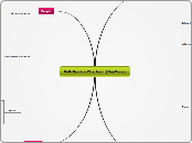
Self-Service Checkout (OneZone)
Activities
Temporal Attributes
Feedback
Regular feedback lets the user know where they are and have more confidance in the checkout system
User must be sent backinformation about what action has actually been done, what result has been accomplished (The touch screen could make a clicking sound or be highlighted in a different colour to indicate when it's been clicked.)
Tacticle
Auditory
Visual
Must offer strong resistance to heavy usage
Quick touch screen reactions (One touch system)
Cooperation & Complexity
User friendly navigation
Customer needs to experience a simple design
Step-by-step guidance
Saftey Issues
Must be cleaned from bacteria
Materials used on checkout must be non-toxic
Safe storage for hot food and dog
Nature of Content
Security Precautions needed to avoid shopliffting
Swift and simple transaction method
People may be in a rush to get to lectures
Technologies
Input
Screen
Touch screen buttons should be sized, coloured and grouped appropriately to avoid user confusion
Screen layout must be in a logical fashion
Resistant to constent/heavy usage
Non-smudging and Non-reflective
Accurately calibrated touch screen system with a quick reaction time
Pictures on screen to match the food selected
Money
Chip & Pin
Cash
Output
Screen
Non-reflective (Easily readable)
Energy Saving and Enviromentaly Friendly
Lights
Green light above checkout
The customers transaction is running smoothly and no help is required
Flashing Orange light above checkout
Alerts member of staff to assist the customer with a problem with the checkout
Speech
Volume Levels
Range of different languages
Preference (Male/Femal)
Comunication
System-to-Consumer
Screen information must be clear and adequately sized for all users
Language selection should be easily reached
System-to-Company
Money tracking system for reporting and monitoring sales figures
People
Usage
Efficiency
System needs to be checked regularlary in order to eliminate any errors of common user problems
Effective functionality
Novice/Expert
Different levels of capability operting the system need to be taken into consideration (Teens/ elderly/ disabled)
Consistent user interface and design
Physical Aspects
Disabilites
Visual
Impairement
Colour-Blindess
Motor/Dexterity
Wheel ChairAccessibility
Must cater for users with athritis, large hands or tenis elbow
Height Restrictions
Auditory
Speech Volume Level needs to be sufficient for those with hearing impairements
Psychological Aspects
Opertaing Self-Service Checkout
Frustration (Machine Errors)
Confusion
Pressure (Queues behind user)
Minimal user cognitive load (Simple instructions)
Contexts
Social
Ease of use
Aids a positive user experience
A selection of different languages should be easily attained to gain an equal experience for international students
Pressure- Must be enough checkouts to avoid the build up of queues during peak times. This could cause the user a intimidating and negative experience, thus detering the customer to not return.
Enviromental
The system should have an adjustable volume level due to the noise of busy canteen, particularly in peak times
Must have a safe place to store hot food and drink when the customer is paying for their meal
Must be easy clean regularlary and the checkout should not bear small grooves that can trap bacteria
Orginisational
There must always be at least one member of staff to assist the customers with any issues during their purchase
Should not require maintanance other than cleaning
There should be a button to call for assistance when required
Self-service checkouts must be cost affective and not a financial burden to the Univeristy
