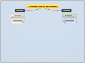
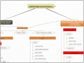
Technology used for Data Analysis
Gapminder
Some countries do not have data available for certain variables/topics
Cannnot input your own data - limited to what is available
Teaching Material Provided
Labs to guide students in their exploration of data
Videos explaining different global patterns and macro-trends -- could use as extra credit!
Questionnaires to assess student understanding
Handouts and Lesson Plans
Map View
Can visualize the relationship between the country and the corresponding variable represented by the size of the data point
Data points are plotted on a map of the world
Timeline View
Incorporates history - students can ask themselves what happened during a certain time period that would have affected the variable being analyzed?
Can highlight/follow a single country
Students can watch how values of different variables change for each country over time
Regular Scatter Plot View
Simply click on variables you want to analyze and the information is there
Analyze the relationship of up to 4 variables in a visually appealing manner
Size of data points represents the fourth variable
Color of data points represent continents/countries (third variable)
Accurate and fact based
From reputable organizations
Lancet
World Bank
International Labour Organization
World Health Organization (WHO)
Not from the news or media
Collected from countries around the world
Students could not easily collect this data themselves
Raise student awareness of global patterns and macro-trends
Economy
Gender
Energy
Health
Environment
FREE!! (does not cost money)
Tinkerplots
Disadvantages
Students may be unfamiliar with the program
Guidance needed
Must set aside time for exploration and explanation
Costs Money
Advantages
Inquiry based
Can explore relationships between variables without being told straight out - for example how are area and perimeter related?
Findings easily shared with classmates - inspires more questions from other students
Students can construct their own questions from the data
Statistical Functions
Click on a data point to see its data card, or the value of each variable for that particular point
Hat Plots - help show students where the data is concentrated
Mean, Median, Mode
Manipulation of Data
Easy to manipulate data, which makes it good for younger students who are just being introduced to data analysis.
Different visual representations of data available
Visually appealing
Can change shape of data points in scatter plot - for example, little cat faces can be your plotted points!
Colors represent different variables
Data can be stacked either vertically or horizontally, which is nice when you have one variable and you want a count of each value
Dividers help represent distribution of data for each type - both numerical and categorical
Graph up to three variables at a time
A certain representation may make more sense to a student with a particular learning style
Scatter Plot
Pie Chart
Histogram
Data Used
Numerical and Categorical
Can use your own data
Hands on experience with real, collectible data
Can copy data from excel or enter it in each data card individually
Relatable to students
