类别 全部 - summary - graphs - data - change

作者:Elizabeth Daniel 12 年以前

474

Graphs

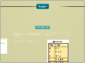
Different types of graphs serve various purposes in data visualization. A line graph is ideal for illustrating changes over time by connecting data points with line segments. Bar graphs, which can be either vertical or horizontal, are useful for comparing multiple data sets and identifying trends.
Graphs

Graphs

Line Graph

Points on a line graph are connected by line segments.
You would use a line graph when you would want to show change over time
A graph in which points representing data pairs are connected bt line segments.

Bar Graph

Bars can be vertical or horizontal
You should use a bar graph when you are just showing multiple data next to each other.
Bars may touch or be seperated.
Bar graphs are useful to get an overall idea of trends in responses.

Stem and Leaf

Stem and Leaf plots can be used to compare values in one set of data, or to compare two sets of related data.
Stem and leaf plots are used to show clusters of datas and spread of data. It is usually for small data sets.
In a stem and leaf plot, each data value is split up into two parts, called the "Stem" and the "Leaf".

Box and Whisker plot

Each section shows 25% of the data.
You would use a box and whisker plot when you give a simple summary of numeric data with 5 or more observations.
A data display that divides data values into four parts.
They use Lower quartile, upper quartile, Lower extreme, upper extreme, and Innerquartile range.

Histogram

Displays data from a frquency table.
You would use a Histogram when analyzing a distribution of data.

It has one bar for each of the intervals.