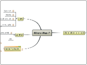
Where Was I?
script / plugins
to allow customisation of none-core features without polluting the scope of the basic application.
integrate with other todo apps
users may want to use the program to retrieve suggested tasks / report time spent etc.
toodledo
the-deadline
rtm
meta / graphics
Probably well within the domain of bloat... but some daydreams:
It might be nice for users to be able to associate their own images with certain tags etc. Could makie a nice visual representation of what work had been done... could be good reinforcement if artistic things are being done...
For that matter, why not hook up with mutator and associate particular items with different synth parameters etc... at some point it might be nice to have some kind of architecture that would allow such things to happen without polluting the main app.
control
tags
current activity
User inputs some text to describe what their intended activity for that time is.
There may be something to be said for the possibility of suggesting tasks from some other todo list application / website, or maybe incorporating more 'todo' functionality here... but this is probably in the domain of classic feature creep / bloat. A simple text description (maybe with #tags) should be ok for now.
global keyboard shortcut
text field in GUI
view
other graphs
option to graph just by unique name, or grouped by regex... tags?
bar
pie
concerns about resources
Application should really aim to be lightweight and get its core task done. While it is running in the background, it should *never* disrupt the machine to the extent that it could cause audio dropouts, for example.
Although the data itself is not particularly volumous, the views in particular have a lot of capacity to become very bloated. It would probably be a mistake to cache too much.
On a very basic level, the GUI should probably be almost totally disposed when it is not active
timeline
Time going vertically.
One column showing users stated 'current activity' over time. Next column showing the actual window that was in the foreground, scaled proportionally to how long the were open for.
Possibly in future colour-coded according to tags.
basic view
before implementing any more sophisticated interactive graphics etc, there should be some sort of basic table or something which allows the basic information to be displayed / filtered / sorted.
information to record
icon (optional)
cost probably extremely trivial... but quite a bit heavier than just getting the string. If there is any evidence it is at all significantly expensive there should be an option not to retrieve it.
program name / executable path?
end time
start time
window title
