Rooms
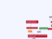
really, we've more rooms than connections, almost, once they're all connected. also, sometimes it just takes to adjust some arrows shape to make it look better, while not having to move any room
OK, I decided to leave it well enough alone, i know what your going for. SO hopefully i didnt mess it up. Personally i dont think its worth the complcation or the time to try and get it all conencting to eveything from any point on the map. But, thats me. And ive never been able to follow the this is connected to that arrow line, on any chart ever, at least not easily. So for me the arrows are pointless. Ill contue to add on, but wont be touching that part. Aside from killing the colors of the boxes by accident, i think the map is the same as when you left it last.
If a color was quite close to another, the Round Cornered Rectangle, was instead changed to a Hexagon, to help distinguish them better. Later on if we need to we can use some of the other shapes as well for the same reason.
ah, dunno if the layout has changed with no you touching it, before it was set on "conceptual map" (3rd from the top) and it was a lot less messy than what it is now. So, aside the color killing, the layout too changed. Anything except the 3rd from the top layout really doesn't work well with arrows.
i've left your schemes with black lining so you can check them while not having to indirectly alter all the map
Well, that sort of kills the purpose of having a single map for anyone. This current one is more like many personal maps in a single place, where each one of us could create his/her own map and then just share it, it would make no difference. Not considering these automatic layout positionings are all but easy to follow, and they just pile one over the other with no apparent order. To follow more easily the arrow line each room should be positioned wisely using the free position layout, surely with this automatic layout it's unreadable.
now, this is how i left it http://i.imgur.com/pzYScbv.png just imagine the arrows like streets and you've nothing different from a common rural street map. if some line crossings look too messy it's always possible to find an other arrangement to make it look better (or just change layout and start from anew)
Voluptua 3
Voluptua 1
Voluptua 2
LyricalJade 1
LyricalJade 2
LyricalJade 3
LyricalJade 5
Kipple 1
Kipple 2
Fystra 1
Mellitus 1
Avnas 1
Kipple Rm1
LyricalJade 4
Myrrah
Anvas
Mellitus
Jyzavi
Temerity
MisBehavin
VivaCity
Arietty_Glitch
Pretzelle
snyg
Lorian
Chillykins
Fystra
FroggerTheMad
coolbetty
KameRider
Girlgeek
Scarf
Zean 1
Zean 2
Rasamalai
ItsAvery
