Data Analysis
Dot Plots
Mode - number Occurs the most often on the line plot
Gap - Large Space
Cluster - Isolated group of points
Outlier - Greater or lesser than
Dot Plots contain Numerical Data on a number line
Pie Charts
Central angle - to find the percent of circle time 360 degrees
Pie charts are very widely used in the business world and the mass media.
Is a circular chart divided into sectors, illustrating numerical proportion.
Histograms
Histograms must have an order, and are made up of adjoining rectangles or bars. Histograms can be made easily with the use of a single-sided stem and leaf plot.
Bar Graphs
There are other bar graphs such as percentage bar graphs, double bar graphs, and stacked bar graphs.
Definition: Has space between the bars and is used to depict categorial data. Order does not matter.
Line Graph
Trend Line - Line that closely fits the data and is used to describe it.
Vertical Line = Variable
Horizontal Line = Time
A line graph shows trends over time.
Pictographs
Every Pictograph has clear title and values represented.
Pictograms are graphs using pictures to represent their numerical values.
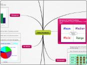
Measures of Central Tendency
Any of a number of ways of specifying a "central value".
Range: Subtract the smallest number in the set from the largest number in the set.
Mode: In a set of numbers, the number that occurs most often.
Median: Arrange the list of numbers in order from least to greatest, then find the middle number (or average of the 2 middle numbers if it is even).
When to use it: another way to show the average of something, in situations withouth symmetrically distributed data.
Mean: Add all the numbers in a set, then divide by how many are in the set.
When to use it: A way to find the average of something. Use when data is symmetrically distributed.
Stem and Leaf Plots
Double Stem and Leaf Plots are used when comparing two different sets of data.
Subtopic
Definition: A diagram that quickly summarizes data while maintaining the individual data points
